Our logo
These branding guidelines will help you determine the best way to use our logo.
![]()
Stewart’s Burgundy is our primary color and used most often.
Logo colors
White
is used on darker backgrounds.
Black
is used on white backgrounds when an ad calls for black and white.
Donations & Contributions Recognition Logo
![]()
This logo is used when recognizing Stewart’s Shops for any donation or contribution given to a group or event. If it will be presented in a small size, we recommend using one of the above logos instead, so that the words in the “wave” are legible.
Thank you ahead of time for not adding extra shadows, colors, decals, graffiti, patterns, or dapper hats to our logo.
Stewart’s Shops colors

- Burgundy: PMS 201 C; CMYK 24,99,78,17; RGB 165,30,54; HEX #a51e36
- White: Hex #FFF
- Black: Hex #000
In writing
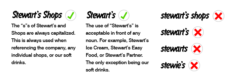
Write Stewart’s Shops in plain text rather than embedding the logo into text.
- The “s”s of Stewart’s and Shops are always capitalized. This is always used when referencing the company, and individual shops, or our soft drinks.
- The use of “Stewart’s” is acceptable in front of any noun. For example, Stewart’s Ice Cream, Stewart’s Easy Food, or Stewart’s Partner. The only exception being our soft drinks.
- Not allowed:
- stewart’s shops
- stewart’s
- stewarts
- stewie’s